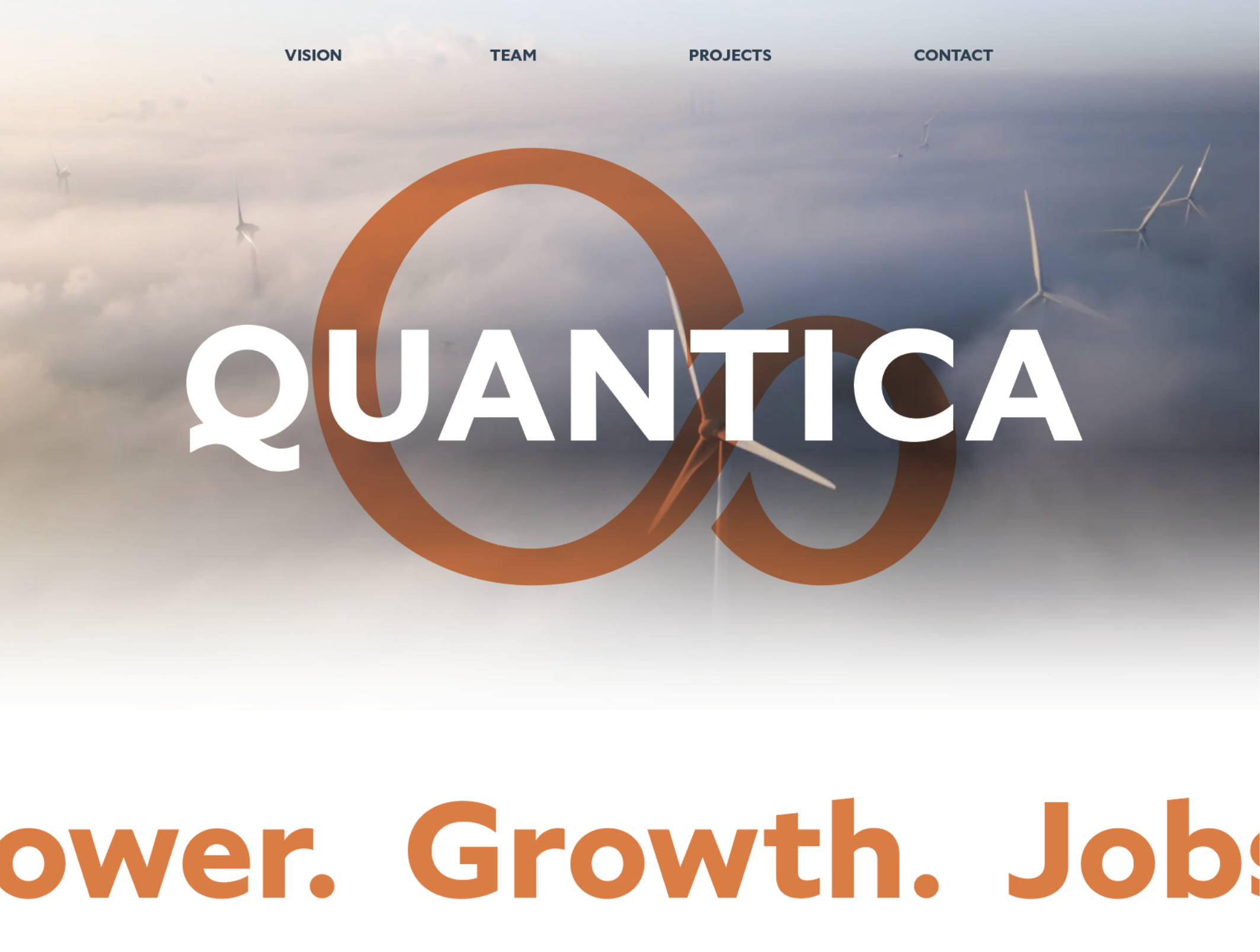
Quantica Infrastructure
I led the strategic development and design for this brand project, aiming to fuse cutting-edge digital infrastructure with a warm, heritage-inspired brand style. Alongside a talented writer, Tom Parker, we helped shape their mission and vision statements, cultivating an identity that felt both approachable and inspirational.
This vision balanced earthy grounding with an airy, forward-thinking aesthetic, centered on their mission of developing low and zero-carbon energy centers to power digital advancements, ultimately delivering affordable wind and solar energy and related services to underserved areas.
Skills: Art Direction, Design, Website creation, Template creation
Software: Adobe Illustrator, Photoshop, Webflow, Powerpoint
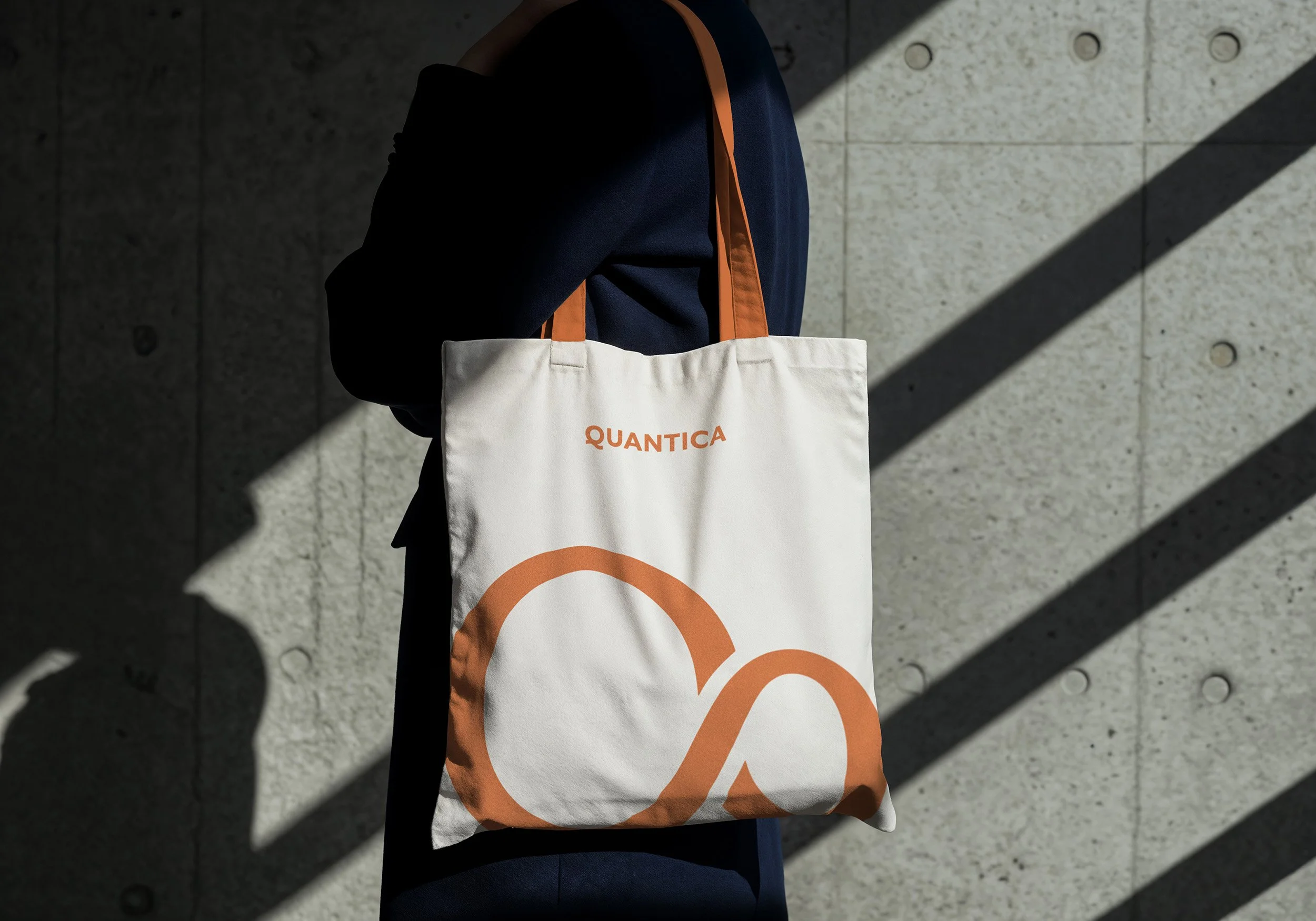
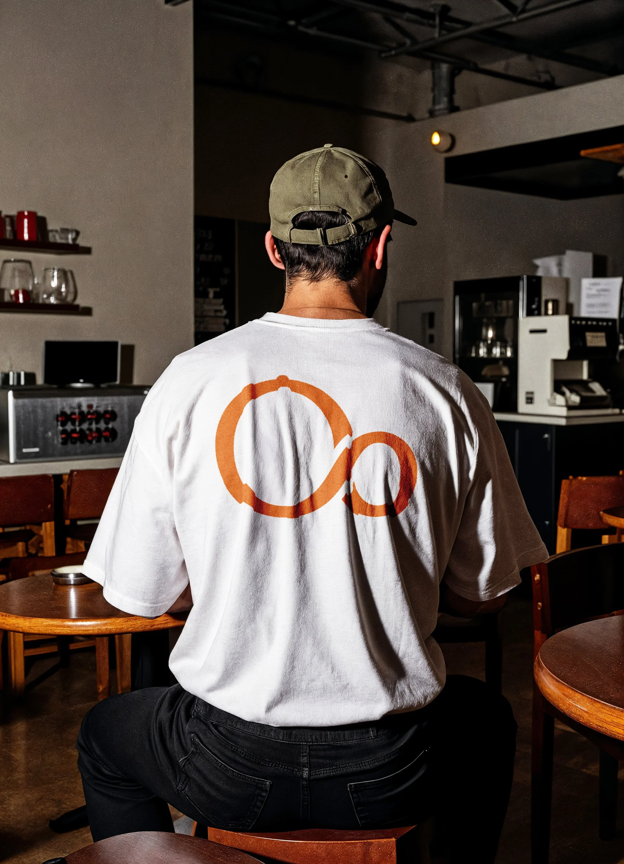
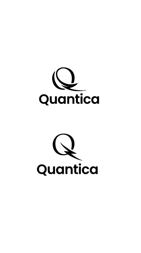
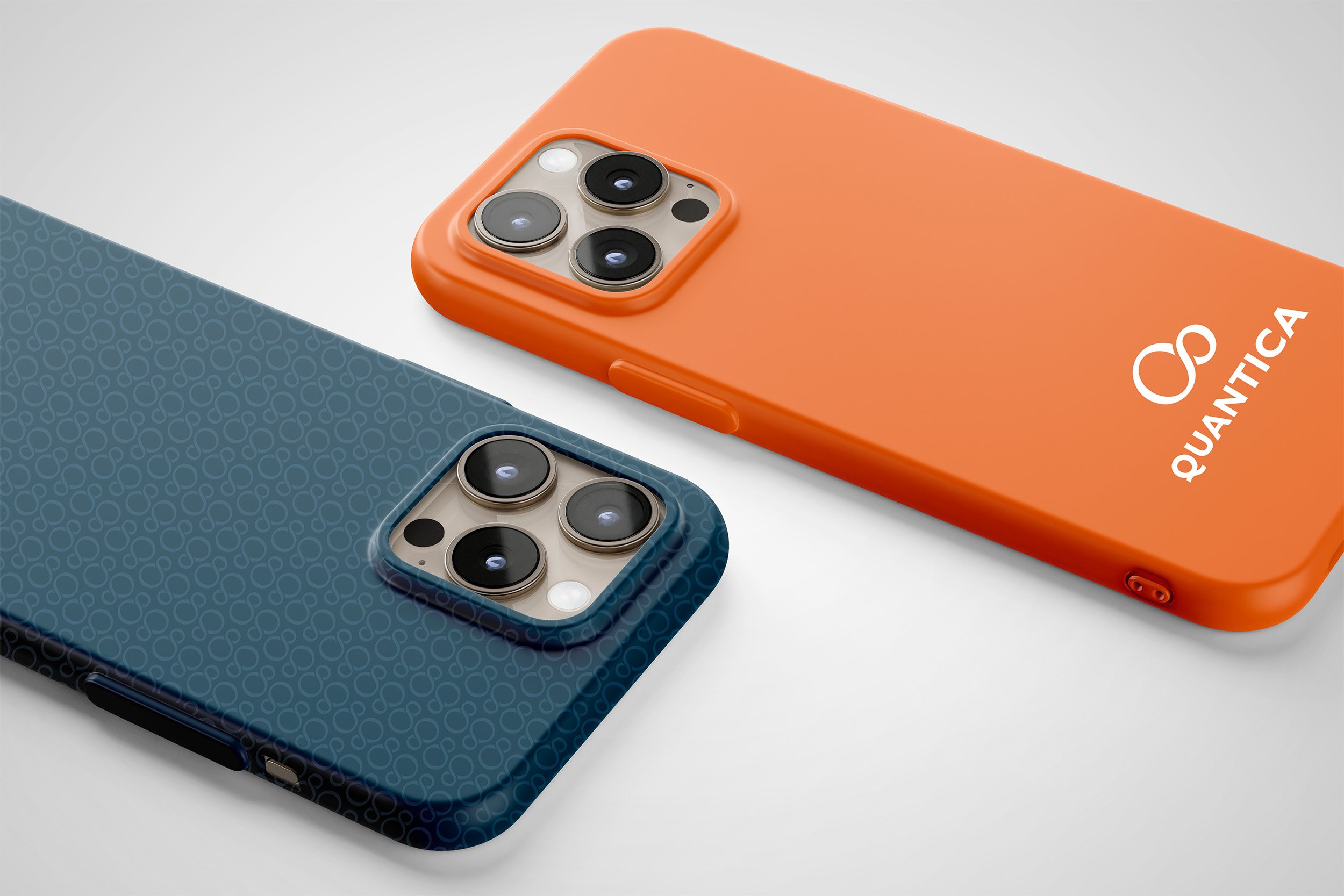
The Brand Mark
Quantica - Main Lockup
The logo, the beating heart of an identity, comprises several distinct elements that form a flexible system.
Together, these components create an ownable mark that skillfully balances a technological essence with organic, earthly elements.

Quantica - Symbol
The infinity “Q” is more than a symbol; it’s a visual representation of Quantica’s core values. It speaks to the limitless potential of renewable energy, the interconnectedness of life, and our unwavering commitment to a sustainable future. Its universal recognition allows us to connect with a global audience.

Quantica - Wordmark
The wordmark's foundation is Specter Bold. I selected it because even as a standalone mark, the descender of the "Q" subtly evokes movement, flow, and energy.
Its high legibility at both large and small sizes, combined with strong contrast, ensures inclusivity for all audiences.
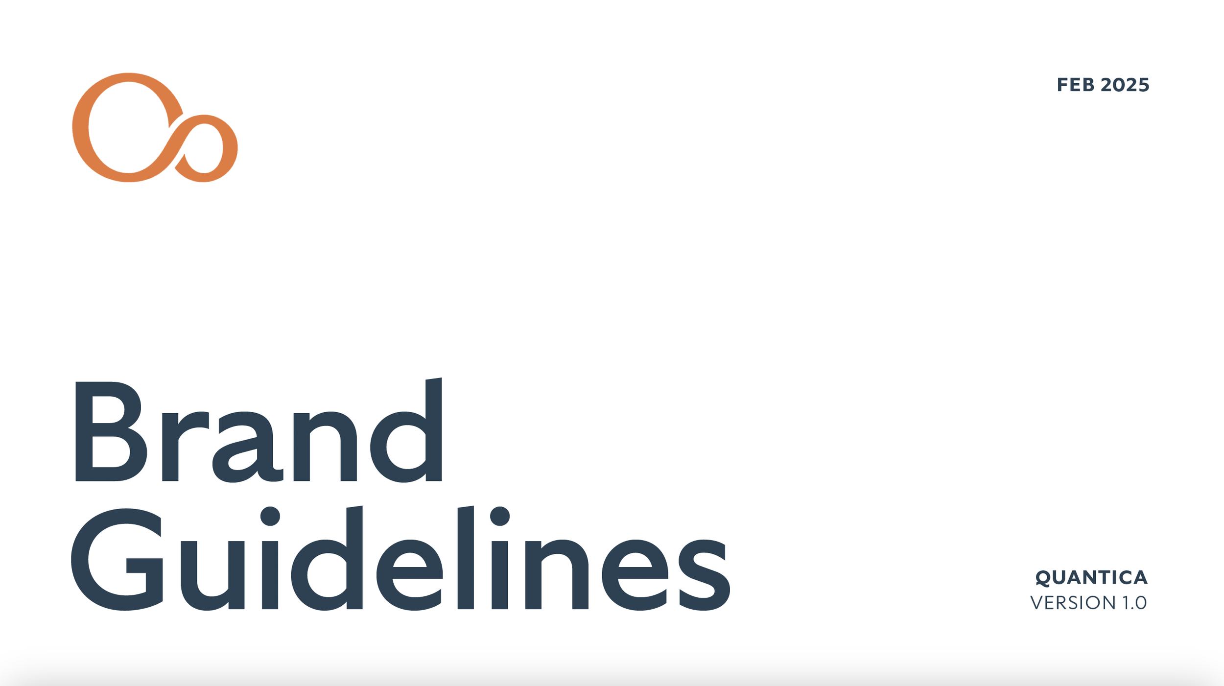
Quantica Brand Guidelines
Below is an abridged brand guidelines slideshow, showcasing all the elements of the Quantica brand and its core messaging. This resource teaches the audience how to correctly apply the brand and understand its core identity. Consistency is paramount for a new brand, and this document serves as an essential guide to maintaining it.
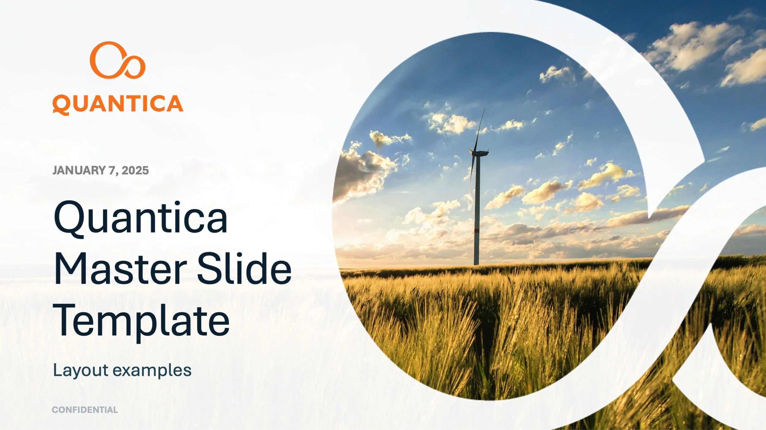
Quantica Slide Deck Template
For an emerging business, a unified story and consistent brand visuals are absolutely crucial. To empower the sales team with this, we developed an extensive presentation deck template. This versatile tool allows them to tailor their message for diverse audiences while consistently presenting a professional and polished brand image. I also integrated slide creation best practices directly within the example slides, ensuring the team can maintain consistent quality across all their presentations.
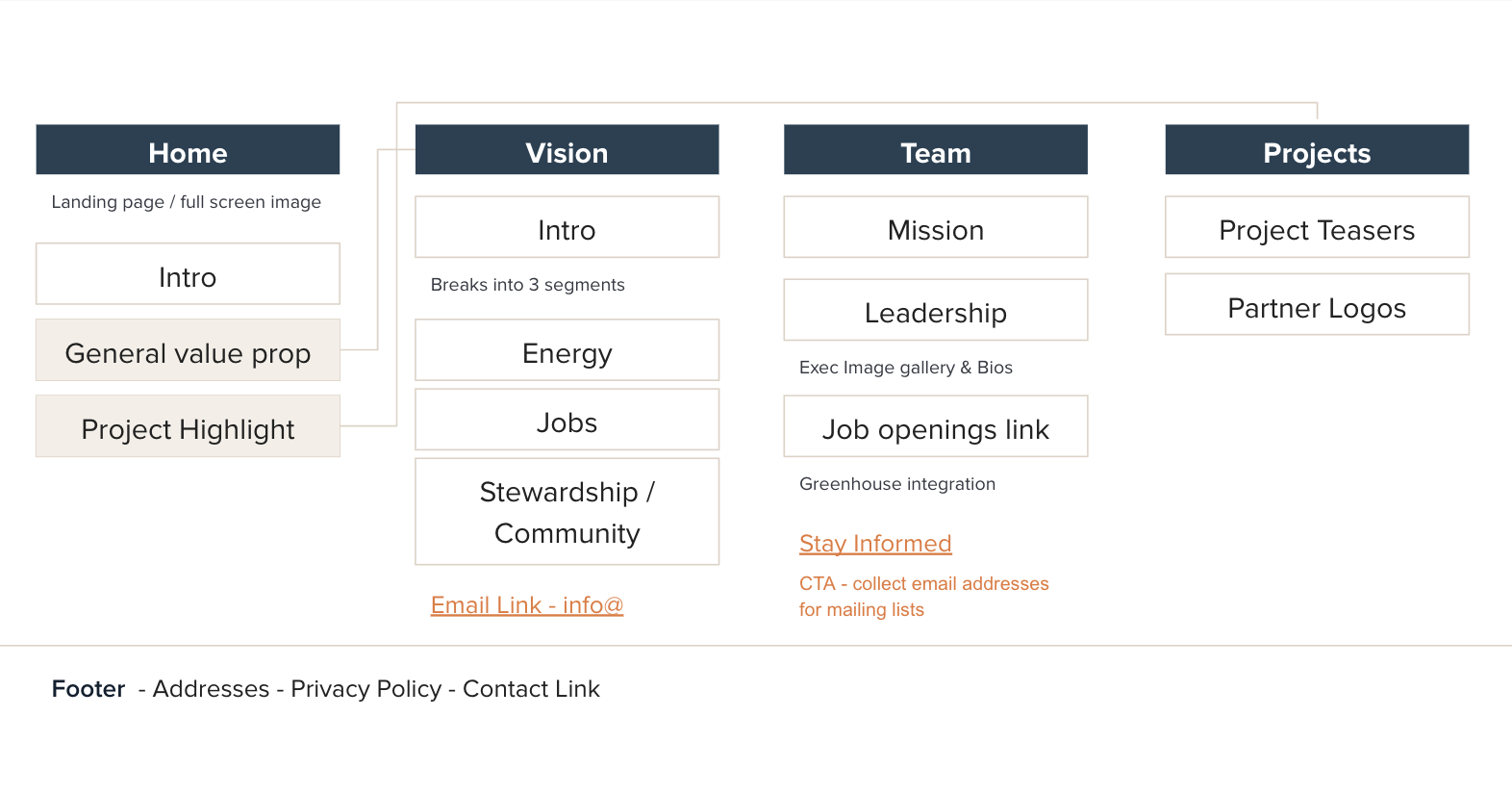
Site Architecture / Responsive Website Design
I led the development of a new website strategy, architecture, and design, with a suggested direction emphasizing a bold, mission-oriented, and contemporary feel. The aim was for a platform that felt both approachable and inspirational, balancing grounded functionality with an elevated, airy aesthetic. This vision, focusing on a blend of "earth and air," was crafted to resonate with the clients and their audience.
My brand design process always begins with a deep dive into a client's core motivations and vision. This involves thoroughly understanding their demographic, inspirations, and desired brand attributes, alongside analyzing competitor logos to identify overarching themes and crucial opportunities for market differentiation.
From this comprehensive research, I develop at least three distinct brand concepts. I find it most efficient to build these initial ideas—essentially my digital sketches—directly in Illustrator, which allows for seamless incorporation of client feedback. For every client project, I include two focused rounds of revisions to ensure the final deliverable precisely aligns with their aspirations.
Design Process
First Round of Design Ideas (a.k.a. Digital Sketches)
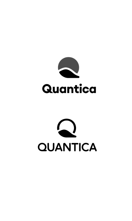
Direction 1: Q shaped landscape
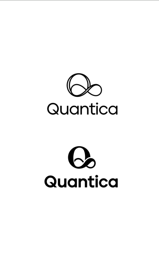
Direction 2: Infinity
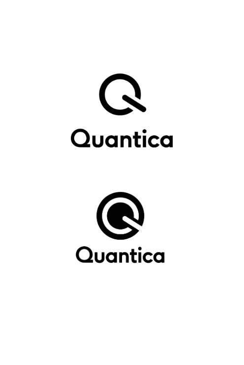
Direction 3: Power Symbol
Direction 4: Electric Flow