Her House Podcast
For the "Her House" podcast, I developed a brand identity with a medical-first approach, aiming to resonate with educated and empowered women. The goal was to establish a visual language that felt like a trusted, knowledgeable source, embodying elegance, simplicity, and relatability to encourage listeners to take charge of their own health journeys.
Skills: Art Direction, Design, Illustration
Software: Adobe Illustrator, Photoshop
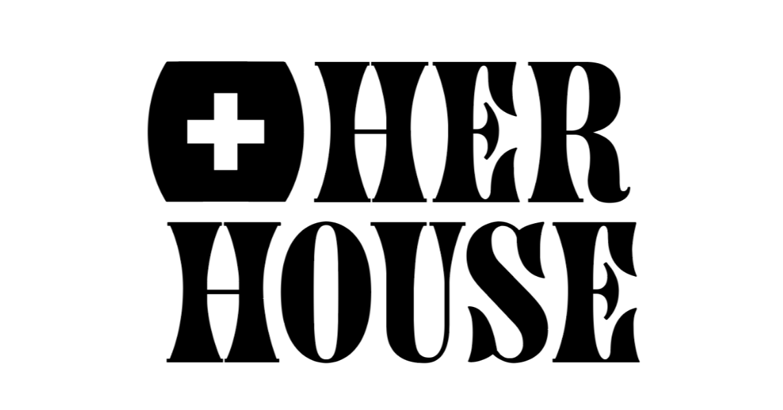
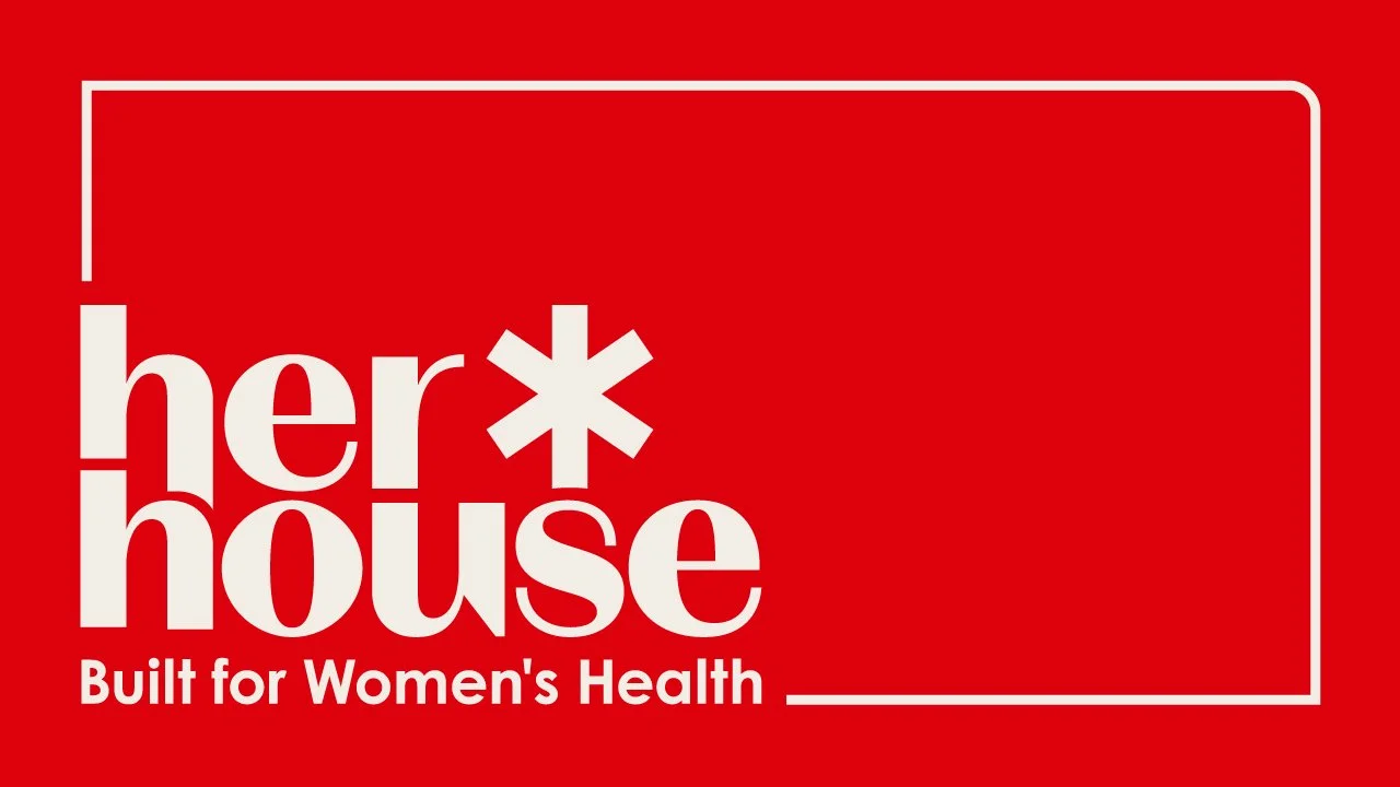
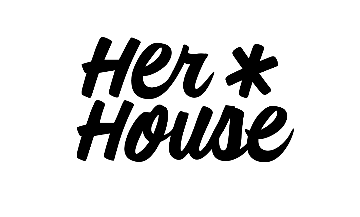
Her House Podcast - Logo Variation
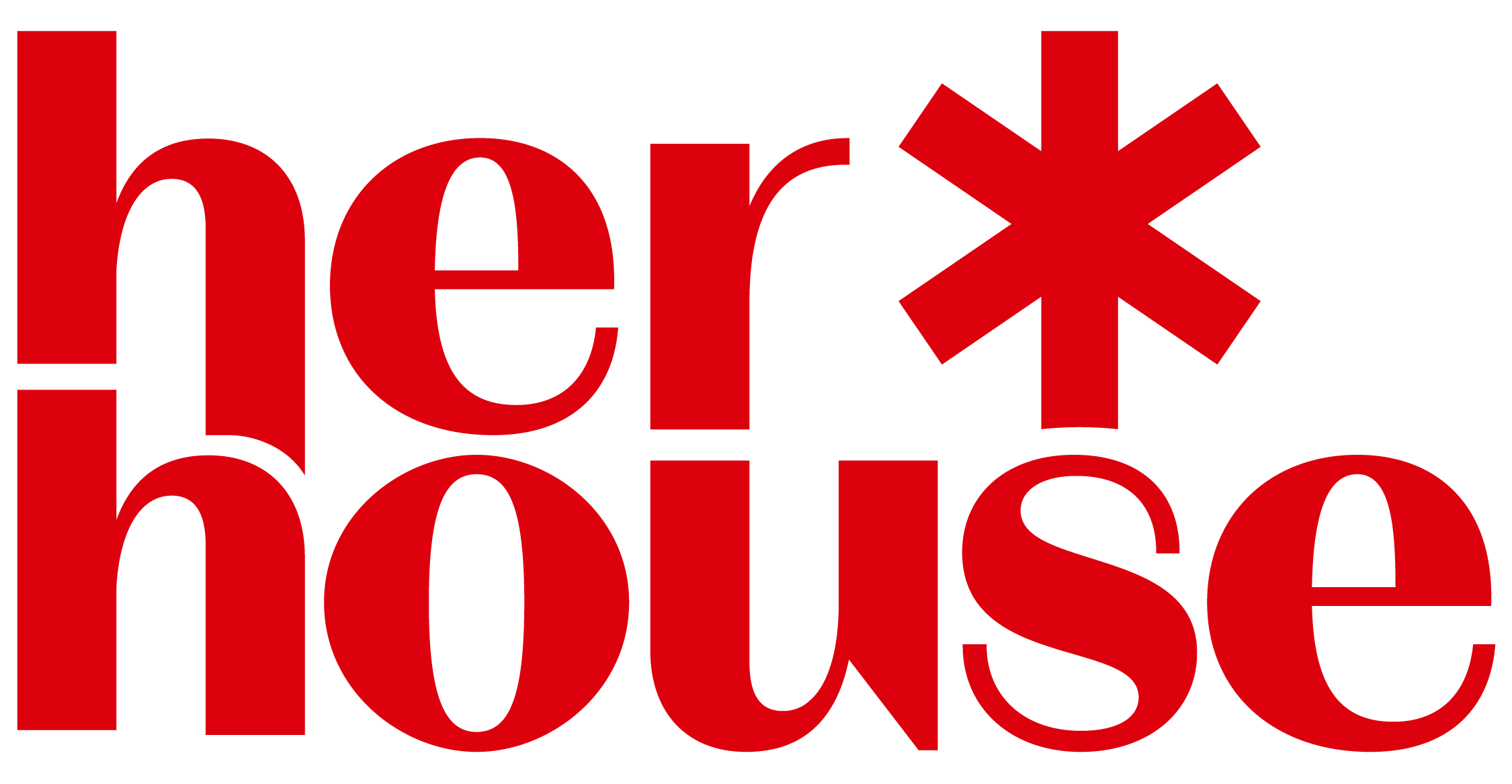
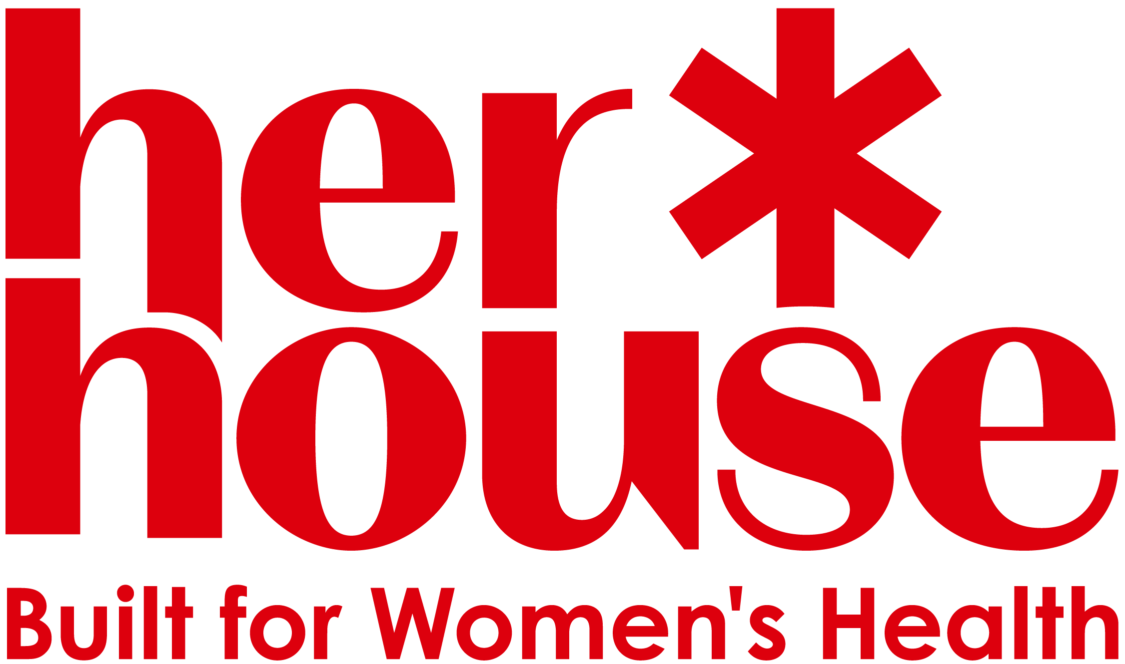
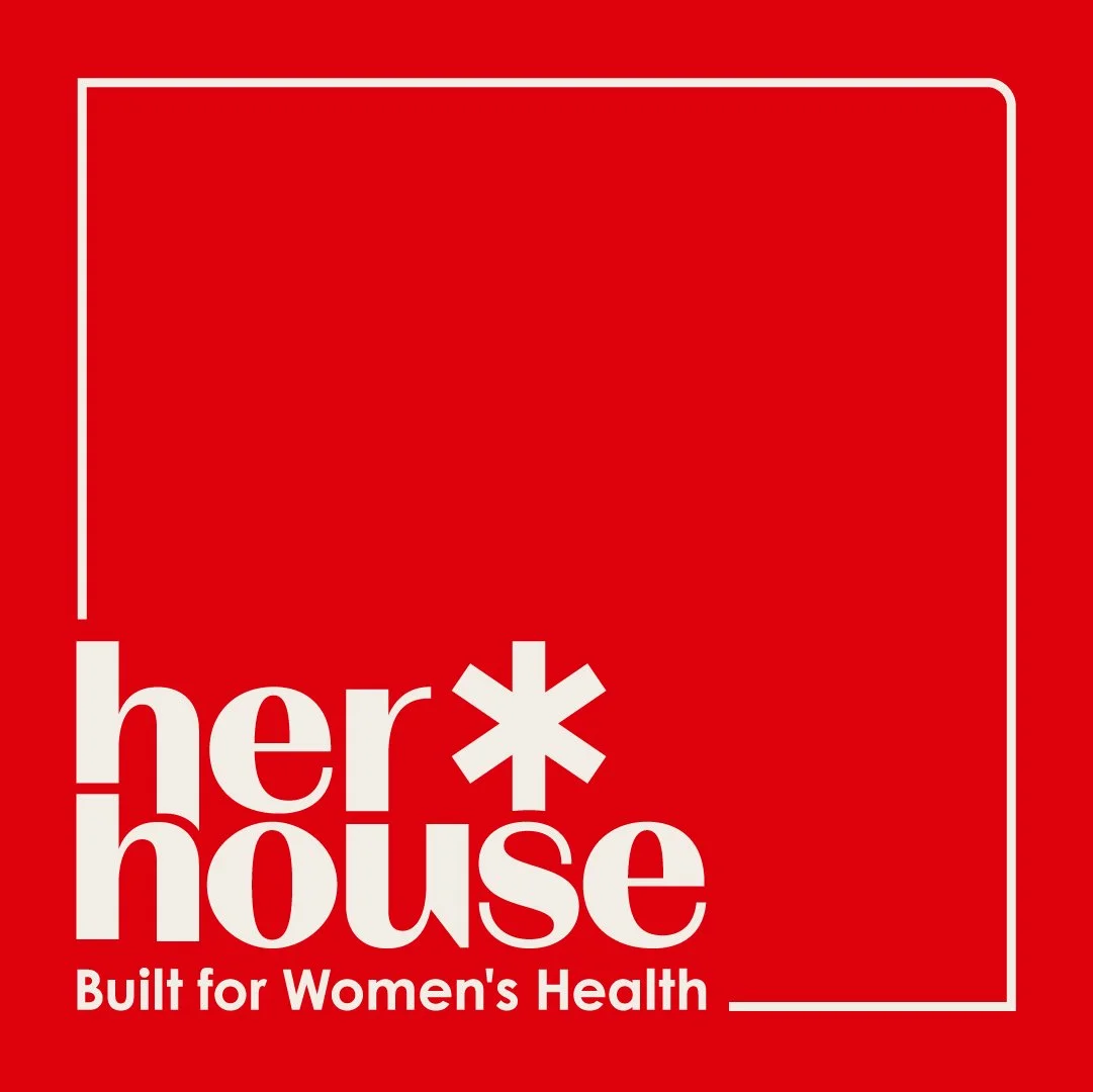
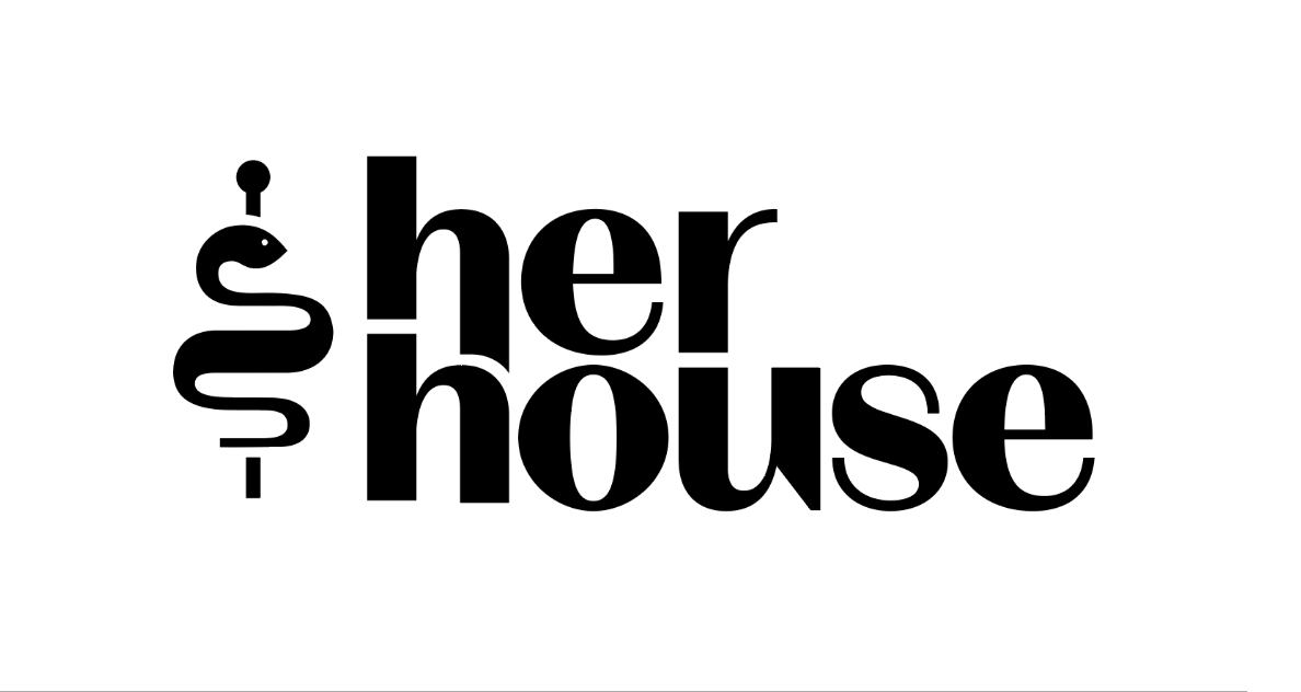
Her House - Primary Logo
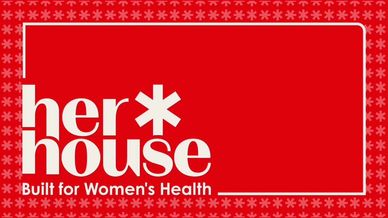
I incorporated the Star of Life symbol to visually connect the podcast to the medical field, immediately cluing viewers into its focus. Each point of the star represents diverse aspects of healthcare, directly relating to the podcast's core mission: highlighting the urgent need to prioritize healthcare for underserved and underrepresented women's health journeys.
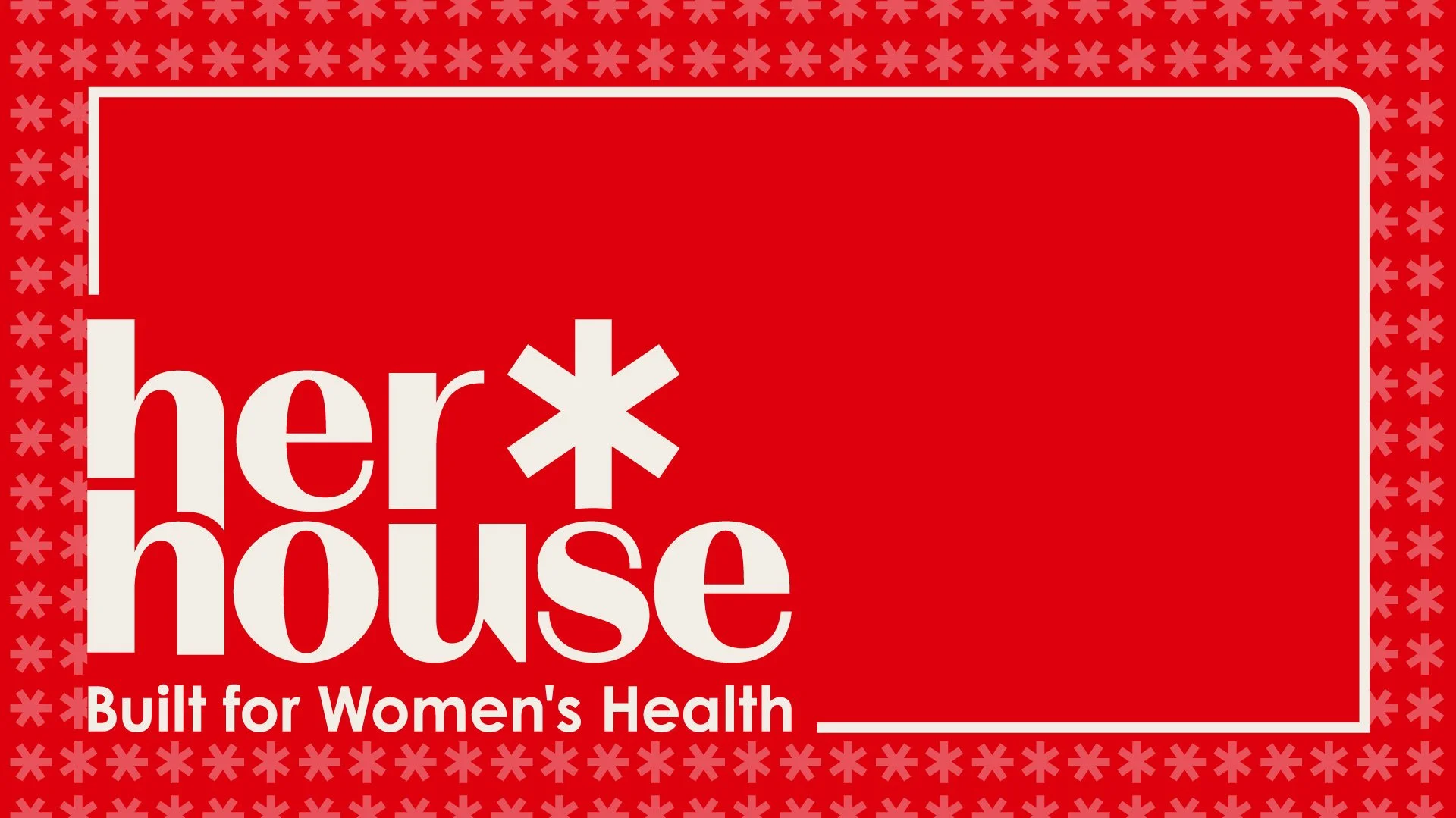
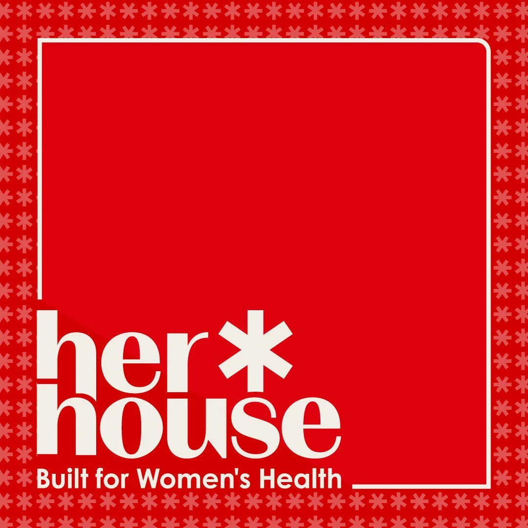
Her House - Tagline Lockup
When the logo requires additional context, we incorporated the company tagline to directly communicate the podcast's focus. Industry research indicated this approach effectively boosts subscriptions and post interactions which is crucial for a new podcast.
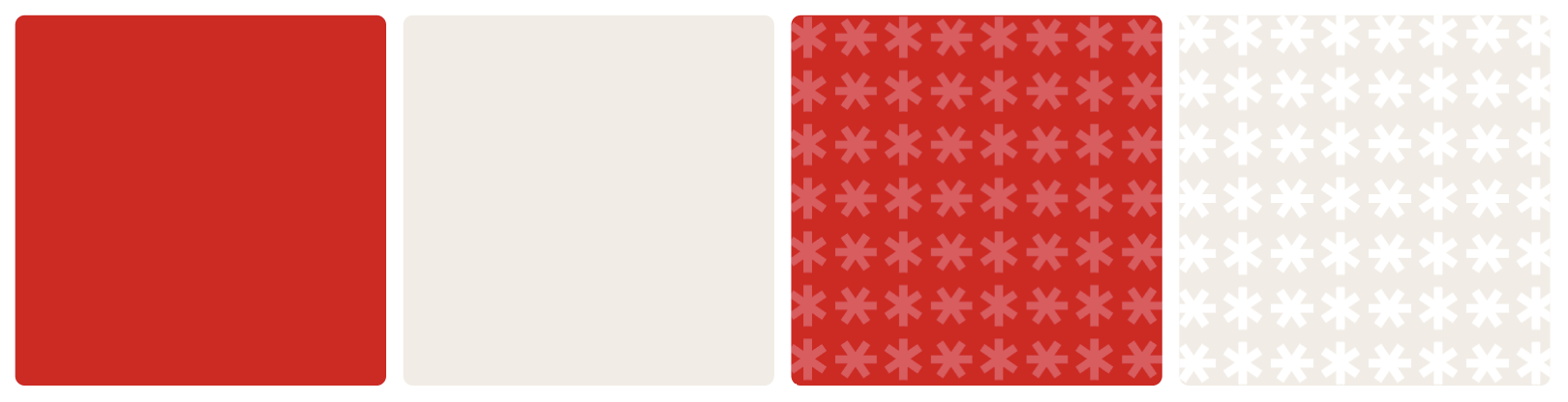
Brand Colors and Pattern
I leveraged the client's preference for red, a color that naturally aligns with a medically focused podcast. I paired it with a soft beige for optimal contrast and as a complementary hue. The chosen Pantone Red, aptly named "Period," was specifically designed to foster global conversations about menstruation through empathetic and accurate portrayals—making it a perfect and straightforward color choice. Additionally, the Star of Life pattern easily transforms into a simple, playful motif for borders or backgrounds..
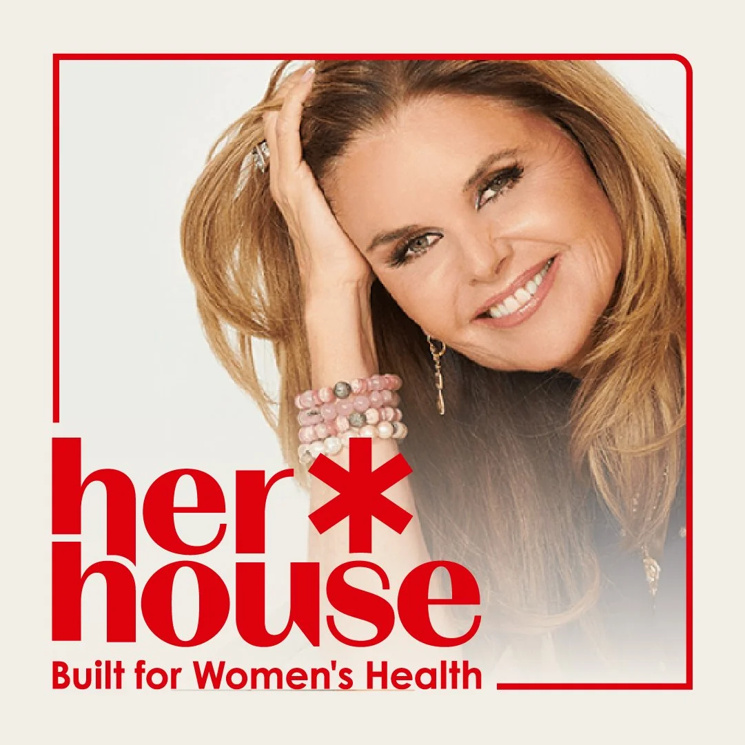
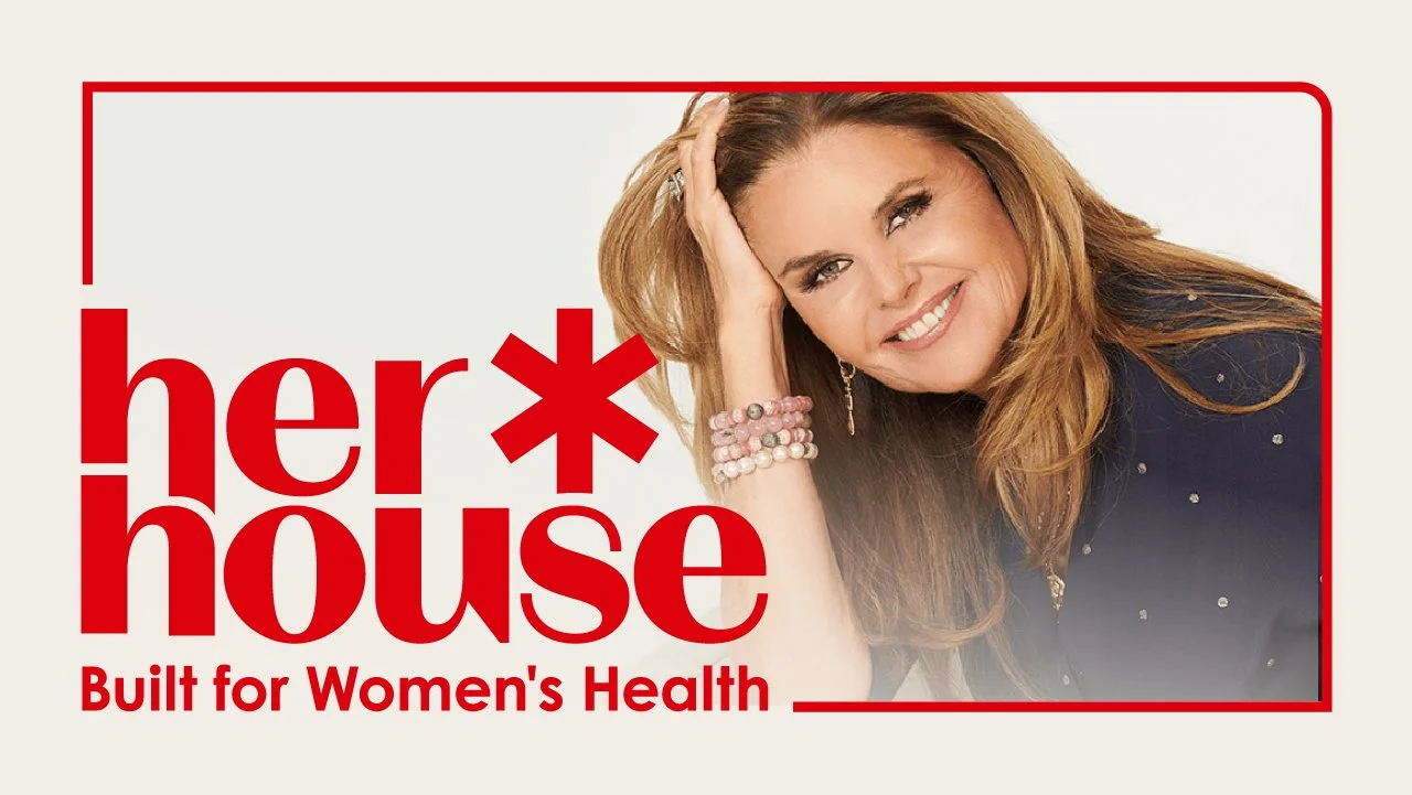
Social Media / Thumbnail Template
I designed three variations for social media posts or episode thumbnails. This approach offers visual diversity for the page and allows for the integration of guest speaker images.
To listen to an episode, you can find HerHouse on Spotify
My brand design process always begins with a deep dive into a client's core motivations and vision. This involves thoroughly understanding their demographic, inspirations, and desired brand attributes, alongside analyzing competitor logos to identify overarching themes and crucial opportunities for market differentiation.
From this comprehensive research, I develop at least three distinct brand concepts. I find it most efficient to build these initial ideas—essentially my digital sketches—directly in Illustrator, which allows for seamless incorporation of client feedback. For every client project, I include two focused rounds of revisions to ensure the final deliverable precisely aligns with their aspirations.
Design Process
First Round of Design Ideas (a.k.a. Digital Sketches)
Direction 1: Star of Life
Direction 2: Rod of Asclepius
Direction 3: Medical Cross