Chef Ryan Scott
Chef Ryan Scott's brand embodies a unique blend of simplicity, approachability, and playfulness, catering to diverse demographics. Throughout the branding journey, our collaborative efforts included insightful branding workshops, establishing effective feedback loops, meticulous design development, thorough competition research, and ultimately culminating in the delivery of a distinctive brand identity. This iterative process ensured a dynamic and engaging brand that resonates with Chef Ryan's vision and appeals to a wide audience.
Skills: Art Direction, Design, Illustration, Website creation
Software: Adobe Illustrator, Photoshop, Webflow
Photography by Chase Daily

The Ryan Scott Brand Family
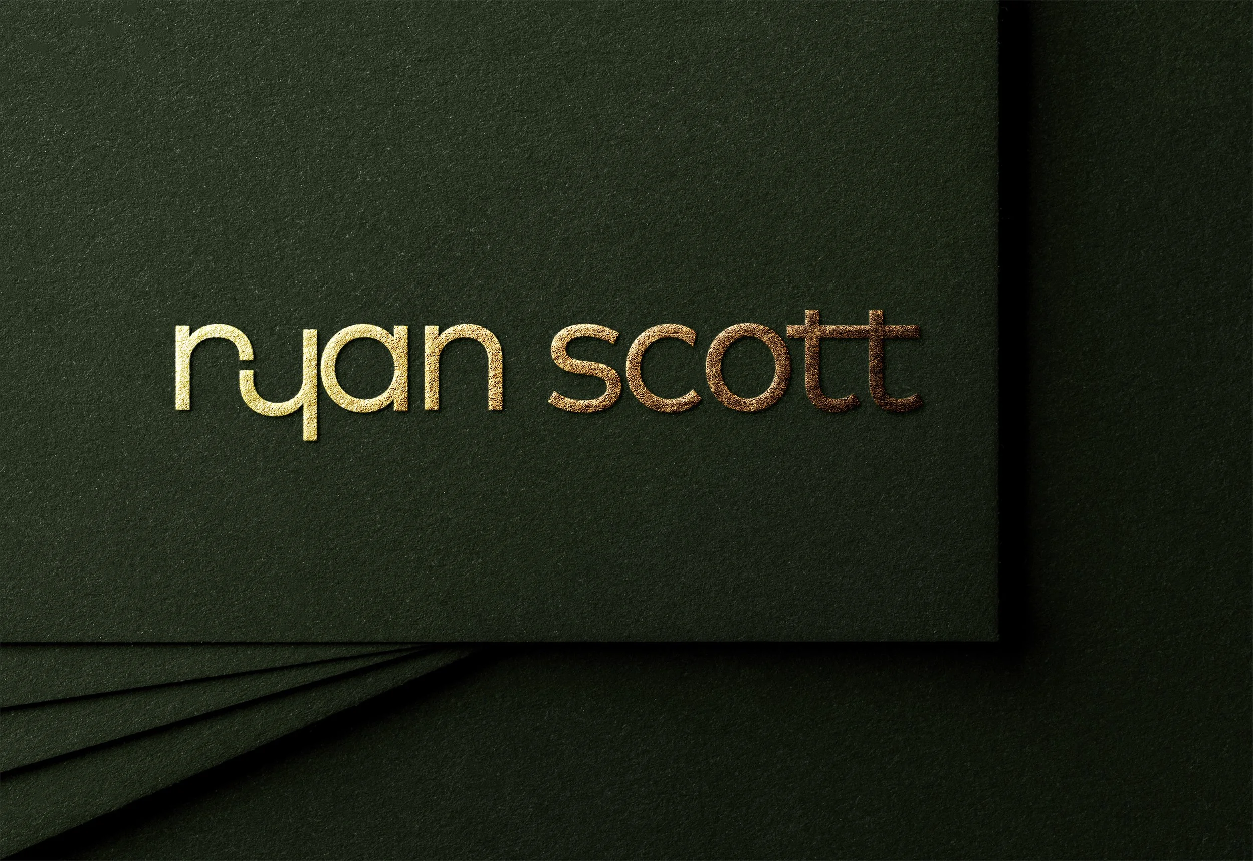
Ryan Scott - Parent Brand
For Chef Ryan Scott's overarching brand, the goal was to craft a core identity that is simple, approachable, and elegantly versatile. This foundational design can then seamlessly adapt and extend across his diverse sub-brands and ventures, ensuring consistent recognition while allowing for individual character.

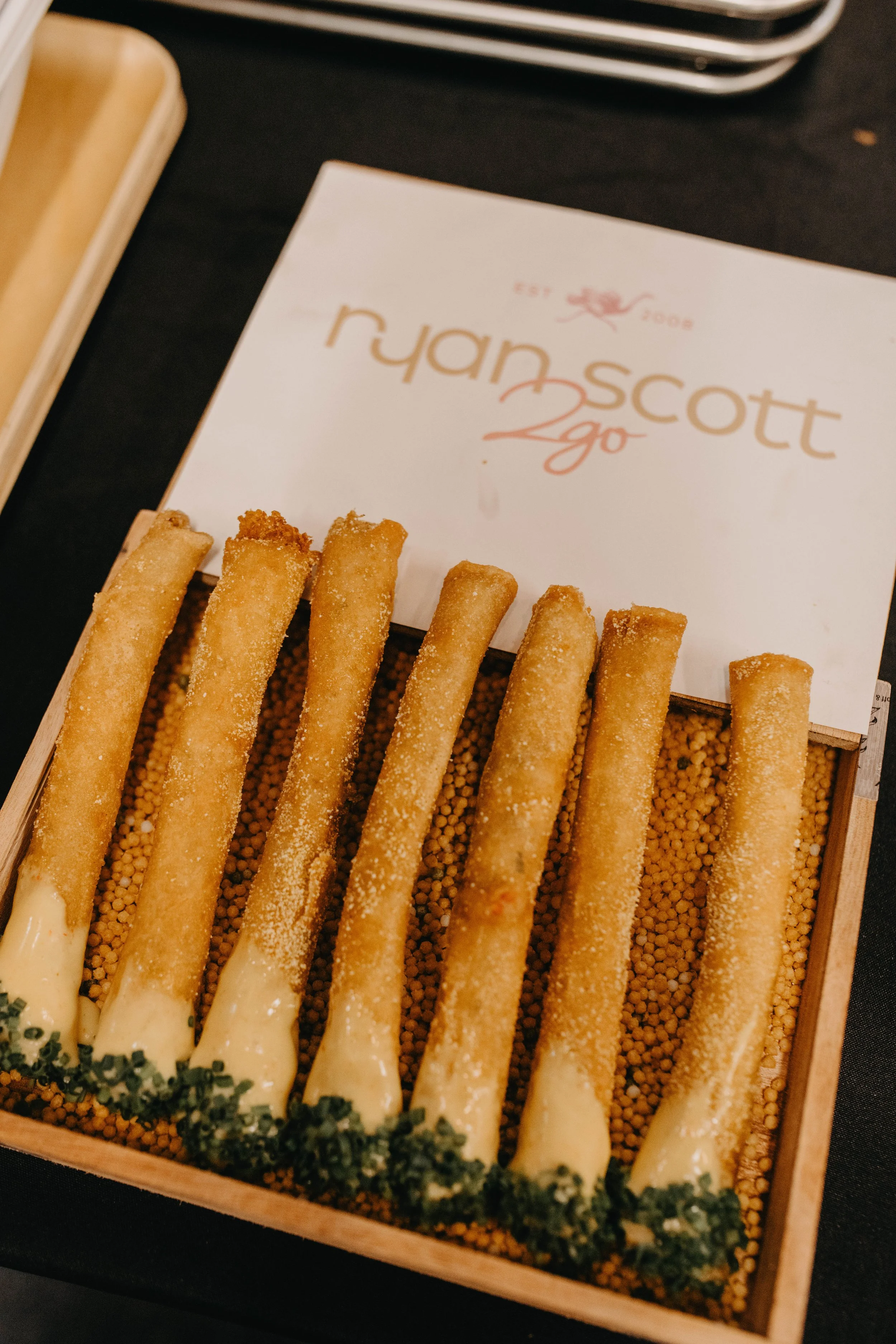
Ryan Scott 2go - Catering Sub Brand
For Chef Ryan's catering venture, RS 2go, we aimed to infuse a distinctly personal touch into this sub-brand. We integrated a hand-drawn "2go" element to add unique flair, ensuring it maintained clear legibility while reinforcing its connection to the overarching brand.

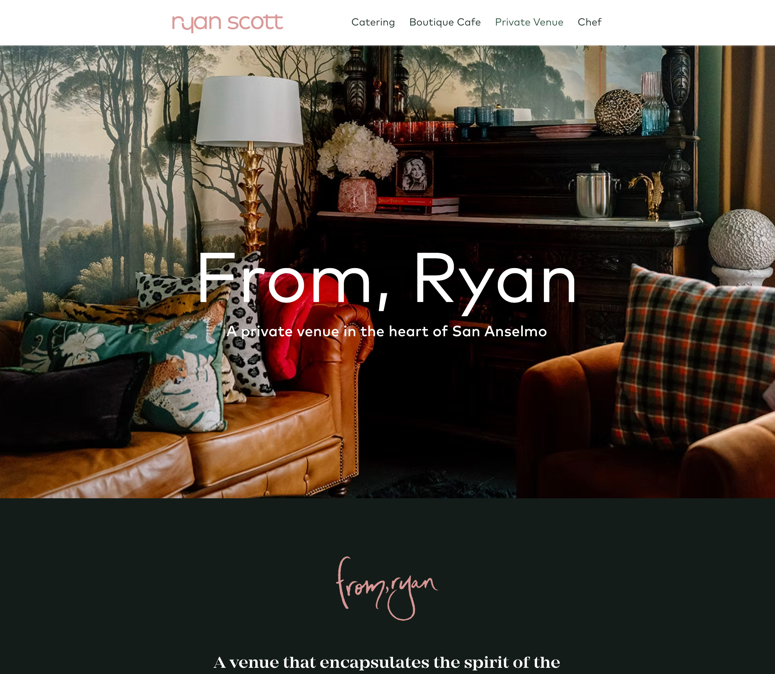
From, Ryan - Event Space Branding
From, Ryan a versatile event space that comes with a lot of personality. We developed a brand that intentionally leans into a relatable human element. This approach ensures the brand feels authentic and approachable, reflecting the genuine connections fostered within its walls.
In our color exploration, the aim was to evoke fun and playfulness while prominently featuring Ryan's signature pink. I paired this with its color wheel complement, a rich green. This color theory choice symbolizes growth, wealth, warmth, and stability—a perfect combination for a talented and ambitious chef.
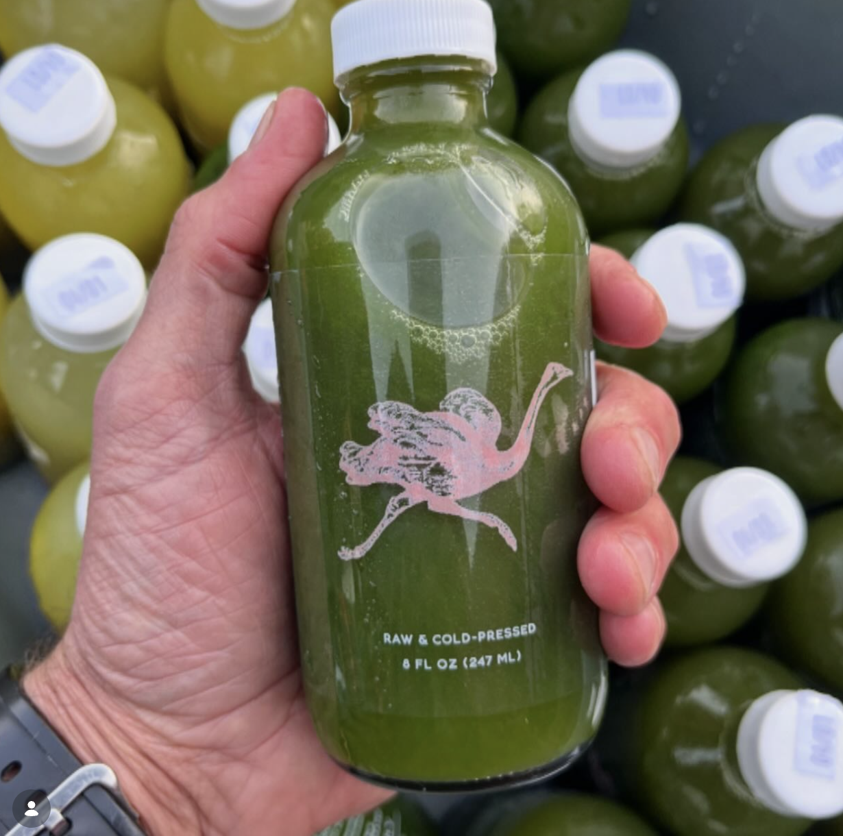
The choice of an ostrich as the brand avatar symbolizes speed, adaptability, and strong family values. We also created a playful graphic pattern that can be added or removed for unexpected delight, perfect for use on to-go containers, wrapping paper, or even wallpaper.
Brand Colors and Pattern

I led the development of a new website strategy, and graphic vernacular that appealed to an elevated demographic. I oversaw the design, development, and photography art direction to create a cohesive and visually appealing site that matched Ryans goals of elevating his target audience. I successfully delivered a new website that not only appealed to Ryan's new audience but also reflected his brand's new positioning. This resulted in increased web traffic by 80%!
Site Architecture / Responsive Website Design


See the live site here: chefryanscott.com
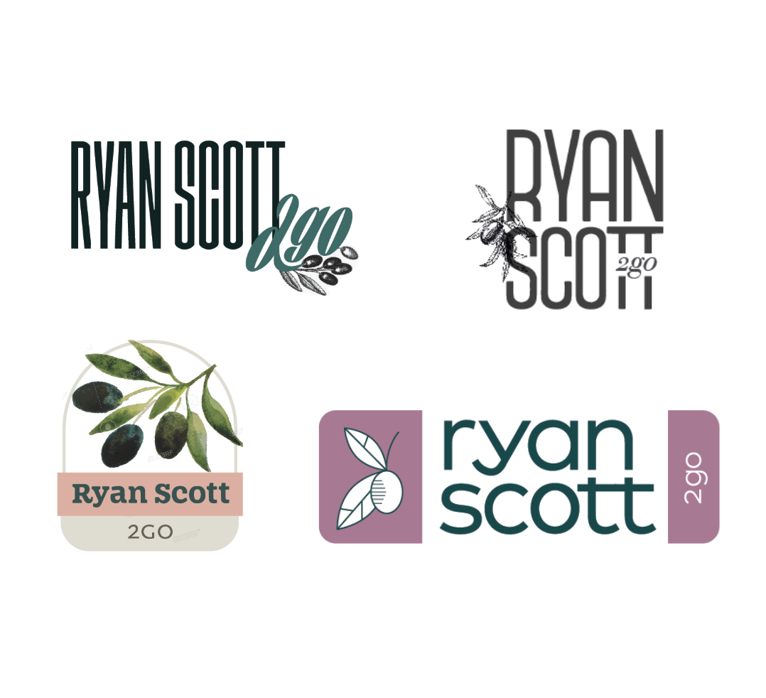
My brand design process always begins with a deep dive into a client's core motivations and vision. This involves thoroughly understanding their demographic, inspirations, and desired brand attributes, alongside analyzing competitor logos to identify overarching themes and crucial opportunities for market differentiation.
From this comprehensive research, I develop at least three distinct brand concepts. I find it most efficient to build these initial ideas—essentially my digital sketches—directly in Illustrator, which allows for seamless incorporation of client feedback. For every client project, I include two focused rounds of revisions to ensure the final deliverable precisely aligns with their aspirations.
Design Process
First Round of Design Ideas (a.k.a. Digital Sketches)
Direction 1: RS Monogram

Direction 2: Ostrich Avatar

Direction 3: Italian Olives